之前为大家分享过一篇关于css3进度条的一篇文章《实现CSS3动态进度条及JQUERY百分比数字显示》,今天为大家带来另一款更具个性化的进度条:CSS3闪烁跳跃的进度条。
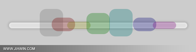
这个示例的原理和以前的都是一样的,都是通过大量的css3属性来实现的,如:animation、transform、keyframes等等属性。值得注意的是这个示例采用了结构性伪类选择符E:nth-child(n),来进行对HTML元素的选择以及控制输出。相信这个伪类选择符在将来会是一个很强大的一个工具。推荐大家多多了解以及实践使用。
这个伪类选择符E:nth-child(n)的含义是匹配父元素的第n个子元素E。 例如:ul li:nth-child(3)表示的是选择<ul>元素里面的第3个<li>。提示一下,该属性在IE8(包含IE8)版本以下是不支持的。下面就一起来看看该示例的实现代码吧,完整的代码可下载附件查看。
HTML结构代码
<div class="center">
  <ul>
    <li>
      <div></div>
    </li>
    <li>
      <div></div>
    </li>
    <li>
      <div></div>
    </li>
    <li>
      <div></div>
    </li>
    <li>
      <div></div>
    </li>
    <li>
      <div></div>
    </li>
    <li>
      <div></div>
    </li>
  </ul>
</div>
CSS样式代码
 @keyframes bump {
 0% {
 opacity: 0;
 left: 535px;
}
 100% {
 left: -10px;
 opacity: 0;
}
 10%, 85% {
 opacity: 1;
}
}
 @keyframes spin {
 0%, 100% {
 height: 20px;
 top: 50px;
}
 50% {
 height: 100px;
 top: 0;
}
}
body {
	background: rgba(0, 0, 0, 0.2);
}
div.center {
	text-align: center;
	margin-top: 40px;
}
ul {
	background-color: rgba(255, 255, 255, 0.4);
	position: relative;
	display: block;
	padding: 0;
	margin: auto;
	width: 600px;
	height: 10px;
	list-style: none;
	border-radius: 200px;
	border: 5px solid rgba(255, 255, 255, 0.2);
	margin-top: 100px;
	box-shadow: 0 0 5px 5px rgba(0, 0, 0, 0.1);
}
ul li {
	position: absolute;
	margin-top: -55px;
}
ul li:nth-child(1) {
	animation: bump 1.5s infinite;
	animation-delay: 0.1s;
}
ul li:nth-child(1) div {
	border-radius: 22px;
	transform-origin: center;
	position: absolute;
	height: 60px;
	width: 80px;
	animation: spin 0.4s infinite;
	animation-delay: 0.1s;
	background-color: rgba(120, 120, 120, 0.3);
}
ul li:nth-child(2) {
	animation: bump 1.5s infinite;
	animation-delay: 0.2s;
}
ul li:nth-child(2) div {
	border-radius: 22px;
	transform-origin: center;
	position: absolute;
	height: 60px;
	width: 80px;
	animation: spin 0.4s infinite;
	animation-delay: 0.2s;
	background-color: rgba(120, 0, 0, 0.3);
}
ul li:nth-child(3) {
	animation: bump 1.5s infinite;
	animation-delay: 0.3s;
}
ul li:nth-child(3) div {
	border-radius: 22px;
	transform-origin: center;
	position: absolute;
	height: 60px;
	width: 80px;
	animation: spin 0.4s infinite;
	animation-delay: 0.3s;
	background-color: rgba(120, 120, 0, 0.3);
}
ul li:nth-child(4) {
	animation: bump 1.5s infinite;
	animation-delay: 0.4s;
}
ul li:nth-child(4) div {
	border-radius: 22px;
	transform-origin: center;
	position: absolute;
	height: 60px;
	width: 80px;
	animation: spin 0.4s infinite;
	animation-delay: 0.4s;
	background-color: rgba(0, 120, 0, 0.3);
}
ul li:nth-child(5) {
	animation: bump 1.5s infinite;
	animation-delay: 0.5s;
}
ul li:nth-child(5) div {
	border-radius: 22px;
	transform-origin: center;
	position: absolute;
	height: 60px;
	width: 80px;
	animation: spin 0.4s infinite;
	animation-delay: 0.5s;
	background-color: rgba(0, 120, 120, 0.3);
}
ul li:nth-child(6) {
	animation: bump 1.5s infinite;
	animation-delay: 0.6s;
}
ul li:nth-child(6) div {
	border-radius: 22px;
	transform-origin: center;
	position: absolute;
	height: 60px;
	width: 80px;
	animation: spin 0.4s infinite;
	animation-delay: 0.6s;
	background-color: rgba(0, 0, 120, 0.3);
}
ul li:nth-child(7) {
	animation: bump 1.5s infinite;
	animation-delay: 0.7s;
}
ul li:nth-child(7) div {
	border-radius: 22px;
	transform-origin: center;
	position: absolute;
	height: 60px;
	width: 80px;
	animation: spin 0.4s infinite;
	animation-delay: 0.7s;
	background-color: rgba(120, 0, 120, 0.3);
}
注:请自行在所需之处加上浏览器前缀(如:-webkit- 、 -moz-),否则将不能正常显示效果。


用作进度条还真挺夸张,不过技术在~
国家化的思维是从左到右的..收到~然后修改一下,哈哈~
很炫啊