最近一直在研究HTML5的动画表现,特别是在移动设备上的呈现。在上一篇文章《盛开的CSS3梦幻荷花》中提到如何用css3制作丰富动画效果的两个思路,当然除此之外,结合使用javascript脚本语言将可以实现更加强大的动画效果以及交互动作。
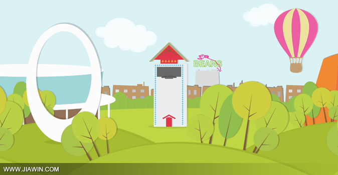
今天就为大家分享一个用HTML5+CSS3制作的城市场景动画,动画包含了白天到夜晚的渐变动画以及太阳、云朵、气球等动画效果;除此之外,页面的视觉效果采用了插画的设计风格,希望大家会喜欢。
一、HTML结构
这个示例中的HTML结构采用了HTML5的语言来编写,代码将更加的简洁、结构更加清晰易懂。从下面的代码可以看出示例中的每个元素是独立的,最后再重组成一个完整的动画效果。
<section>
  <div class="stage">
    <div class="nightOverlay"></div>
    <div class="skyline"></div>
    <div class="beans"></div>
    <div class="ground back"></div>
    <div class="ground mid"></div>
    <div class="ground front"></div>
    <div class="cloud large"></div>
    <div class="cloud small"></div>
    <div class="cloud medium"></div>
    <div class="balloon"></div>
    <div class="dowEventCenter"></div>
    <div class="planetarium"></div>
    <div class="friendshipShell"></div>
    <div class="glockenspiel"></div>
    <div class="rotation">
      <div class="sun"></div>
      <div class="moon"></div>
    </div>
  </div>
</section>
二、动画解析
整个城市场景的动画是由若干个元素的动画组成,如:天空的变化、云朵的运动、太阳的自转等等。在下面我们一一来为大家解析每个动画的实现思路以及代码组成。
天空的变化
.stage {
	position: relative;
	overflow: hidden;
	height: 600px;
	background: #ddf5f7;
	-webkit-animation: skyset 110s infinite linear;
	-moz-animation: skyset 110s infinite linear;
	-o-animation: skyset 110s infinite linear;
	animation: skyset 110s infinite linear;
}
@keyframes skyset {
 0% {
 background: #ddf5f7;
}
 23% {
 background: #ddf5f7;
}
 25% {
 background: #350847;
}
 27% {
 background: #0f192c;
}
 50% {
 background: #0f192c;
}
 68% {
 background: #0f192c;
}
 75% {
 background: #f9c7b8;
}
 82% {
 background: #ddf5f7;
}
 100% {
 background: #ddf5f7;
}
}
天空的颜色逐渐的变暗然后又变亮,这是一个有序的过程,但得注意时间的安排。
天黑遮罩层变化
当天空变暗时,也就是到黑夜时,整个城市也是变暗的,所以我们在整个城市的上方加个遮罩层,以背景色来实现,逐渐改变其透明度来实现变化。
.nightOverlay {
	z-index: 9999;
	position: absolute;
	top: 0;
	left: 0;
	right: 0;
	bottom: 0;
	background: rgba(15, 25, 44, 0.7);
	opacity: 0;
	-webkit-animation: set 110s infinite linear;
	-moz-animation: set 110s infinite linear;
	-o-animation: set 110s infinite linear;
	animation: set 110s infinite linear;
}
 @keyframes set {
 0% {
 filter: progid:DXImageTransform.Microsoft.Alpha(Opacity=0);
 opacity: 0;
}
 50% {
 filter: progid:DXImageTransform.Microsoft.Alpha(Opacity=100);
 opacity: 1;
}
 100% {
 filter: progid:DXImageTransform.Microsoft.Alpha(Opacity=0);
 opacity: 0;
}
}
太阳自转以及动画
在这里我们需要两个图标,一个是白天的太阳(黄色),一个是夜晚的太阳(黑色)。然后我们再让这个图片轮流显示在画面上就行。
.rotation {
	position: absolute;
	z-index: 1;
	left: 50%;
	top: 50%;
	margin: -350px 0 0 -350px;
	height: 700px;
	width: 700px;
	-webkit-transform: rotate(45deg);
	-moz-transform: rotate(45deg);
	-ms-transform: rotate(45deg);
	-o-transform: rotate(45deg);
	transform: rotate(45deg);
	-webkit-animation: rotation 110s infinite linear;
	-moz-animation: rotation 110s infinite linear;
	-o-animation: rotation 110s infinite linear;
	animation: rotation 110s infinite linear;
}
 @keyframes rotation {
 0% {
 transform: rotate(45deg);
}
 100% {
 transform: rotate(405deg);
}
}
.sun, .moon {
position: absolute;
height: 145px;
width: 145px;
-webkit-border-radius: 50%;
-moz-border-radius: 50%;
-ms-border-radius: 50%;
-o-border-radius: 50%;
border-radius: 50%;
}
.sun {
top: 0;
left: 0;
background: yellow;
}
.moon {
bottom: 0;
right: 0;
background: black;
}
云朵的移动
示例中总共有三朵云朵,分别为大、中、小,为了有更加逼真的效果,我们要分别定义三朵云朵的运动速度、位置以及大小。
.cloud {
	position: absolute;
}
.cloud.small {
	z-index: 1;
	top: 5%;
	left: 15%;
	background: url(images/cloudSmall.png) no-repeat no-repeat center;
	height: 50px;
	width: 89px;
	-webkit-animation: cloudSmall 165s infinite;
	-moz-animation: cloudSmall 165s infinite;
	-o-animation: cloudSmall 165s infinite;
	animation: cloudSmall 165s infinite;
}
.cloud.medium {
	z-index: 3;
	top: 25%;
	left: 30%;
	background: url(images/cloudMedium.png) no-repeat no-repeat center;
	height: 92px;
	width: 159px;
	-webkit-animation: cloudMedium 80s infinite;
	-moz-animation: cloudMedium 80s infinite;
	-o-animation: cloudMedium 80s infinite;
	animation: cloudMedium 80s infinite;
}
.cloud.large {
	z-index: 2;
	top: 5%;
	right: 15%;
	background: url(images/cloudLarge.png) no-repeat no-repeat center;
	height: 169px;
	width: 302px;
	-webkit-animation: cloudLarge 105s infinite;
	-moz-animation: cloudLarge 105s infinite;
	-o-animation: cloudLarge 105s infinite;
	animation: cloudLarge 105s infinite;
}
 @keyframes cloudSmall {
 0% {
 left: -8%;
}
 100% {
 left: 108%;
}
}
 @keyframes cloudMedium {
 0% {
 left: -8%;
}
 100% {
 left: 108%;
}
}
 @keyframes cloudLarge {
 0% {
 right: -18%;
}
 100% {
 right: 118%;
}
}
气球的漂浮
接下来是气球的漂浮,可适当的给予摇摆的动作。
.balloon {
	position: absolute;
	z-index: 3;
	top: 5%;
	right: 20%;
	background: url(images/balloon.png) no-repeat no-repeat center;
	height: 227px;
	width: 157px;
	-webkit-animation: balloon 30s infinite cubic-bezier(0.91, 0.01, 1, 0.89);
	-moz-animation: balloon 30s infinite cubic-bezier(0.1, 0.1, 0.95, 0.5);
	-o-animation: balloon 30s infinite cubic-bezier(0.1, 0.1, 0.95, 0.5);
	animation: balloon 30s infinite cubic-bezier(0.1, 0.1, 0.95, 0.5);
}
 @keyframes balloon {
 0% {
 right: -20%;
 transform: rotate(0deg);
}
 5% {
 right: -20%;
 transform: rotate(0deg);
}
 25% {
 transform: rotate(0deg);
}
 100% {
 right: 120%;
 transform: rotate(-30deg);
}
}
到这里,我们的动画效果基本已经完成了,其中需要添加浏览器前缀的请自行添加。或者下载我们的附件参看完整的css源代码。
三、城市场景组成图片
最后,就是我们城市场景的图片组件了。
.skyline {
	position: absolute;
	z-index: 5;
	width: 100%;
	bottom: 26%;
	background: url(images/skyline.png) repeat no-repeat;
	height: 147px;
}
.beans {
	position: absolute;
	z-index: 4;
	height: 201px;
	width: 88px;
	bottom: 30%;
	left: 50%;
	background: url(images/beans.png) no-repeat no-repeat;
}
.ground {
	position: absolute;
	width: 100%;
	bottom: 0;
}
.ground.front {
	z-index: 30;
	background: url(images/groundFront.png) repeat no-repeat center;
	height: 301px;
}
.ground.mid {
	z-index: 20;
	background: url(images/groundMid.png) repeat no-repeat;
	height: 299px;
}
.ground.back {
	z-index: 10;
	background: url(images/groundBack.png) repeat no-repeat center;
	height: 281px;
}
.dowEventCenter {
	position: absolute;
	z-index: 12;
	bottom: 20%;
	left: 5%;
	background: url(images/dowEventCenter.png) no-repeat no-repeat center;
	height: 236px;
	width: 524px;
}
.planetarium {
	position: absolute;
	z-index: 12;
	bottom: 18%;
	right: 10%;
	background: url(images/Planetarium.png) no-repeat no-repeat center;
	height: 285px;
	width: 347px;
}
.friendshipShell {
	position: absolute;
	z-index: 21;
	bottom: 18%;
	left: 20%;
	background: url(images/friendshipShell.png) no-repeat no-repeat center;
	height: 370px;
	width: 231px;
}
.glockenspiel {
	position: absolute;
	z-index: 11;
	bottom: 26%;
	right: 50%;
	background: url(images/Glockenspiel.png) no-repeat no-repeat center;
	height: 263px;
	width: 137px;
}
ok,我们的示例分享就到这里,希望大家会喜欢,更加希望大家可以拿这个小小的示例多加练习,多加研究每个动画的实现技巧。


很不错!
我也有几篇css3的文章,还望相互交流
http://www.haorooms.com/tag/css3
代码也很多的主,不太实用
COOL动画!
来学习了、、
不错,阅读了一下。
keyframe是个好东西
这个动画是用哪个软件做的啊?我只知道二维、三维动画。捧腹网每日动漫,http://www.jingdianwenji.com/neihantu/pengfudm/。
每次有 infinite 的颜色变化时,我的风扇就开始咆哮了。。
怒顶一下
你的机子也太矫情了
强大!
不错不错,果断顶。不过太阳从西边升起了,月亮是黑色的,这不科学啊…昼夜交替的颜色不错
没有科不科学,需求说了算。哈哈
大爱这个站!
您也可以使用第三方帐号登录
您也可以使用第三方帐号快捷注册