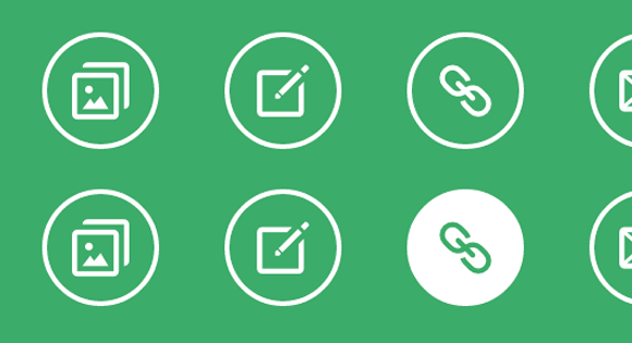
今天就为大家分享一组时尚而简单的鼠标经过图标动画效果。主要的原理是当经过图标或触发其伪元素时,利用css的transitions和animations属性,来实现的一些互动动画效果。在此之前,本站也介绍了很多css伪元素的文章,如:动画条纹边框、伪元素的多重选择、制作时尚焦点图相框等等。
构建HTML基本结构
在本示例当中用到的HTML结构极其简单,在一个大的div容器中放了几个描文本,通过css的样式控制就可以制作出多种效果出来,如下:
<div class="hi-icon-wrap hi-icon-effect-1 hi-icon-effect-1a">
    <a href="#" rel="external nofollow"  rel="external nofollow"  rel="external nofollow"  rel="external nofollow"  rel="external nofollow"  rel="external nofollow"  rel="external nofollow"  rel="external nofollow"  rel="external nofollow"  rel="external nofollow"  class="hi-icon hi-icon-mobile">Mobile</a>
    <a href="#" rel="external nofollow"  rel="external nofollow"  rel="external nofollow"  rel="external nofollow"  rel="external nofollow"  rel="external nofollow"  rel="external nofollow"  rel="external nofollow"  rel="external nofollow"  rel="external nofollow"  class="hi-icon hi-icon-screen">Desktop</a>
    <a href="#" rel="external nofollow"  rel="external nofollow"  rel="external nofollow"  rel="external nofollow"  rel="external nofollow"  rel="external nofollow"  rel="external nofollow"  rel="external nofollow"  rel="external nofollow"  rel="external nofollow"  class="hi-icon hi-icon-earth">Partners</a>
    <a href="#" rel="external nofollow"  rel="external nofollow"  rel="external nofollow"  rel="external nofollow"  rel="external nofollow"  rel="external nofollow"  rel="external nofollow"  rel="external nofollow"  rel="external nofollow"  rel="external nofollow"  class="hi-icon hi-icon-support">Support</a>
    <a href="#" rel="external nofollow"  rel="external nofollow"  rel="external nofollow"  rel="external nofollow"  rel="external nofollow"  rel="external nofollow"  rel="external nofollow"  rel="external nofollow"  rel="external nofollow"  rel="external nofollow"  class="hi-icon hi-icon-locked">Security</a>
</div>
简单的动画效果示例
这只是本文章中的其中一个示例(6),主要的效果是旋转动画。
.hi-icon-effect-6 .hi-icon {
    box-shadow: 0 0 0 4px rgba(255,255,255,1);
    transition: background 0.2s, color 0.2s;
}

.no-touch .hi-icon-effect-6 .hi-icon:hover {
    background: rgba(255,255,255,1);
    color: #64bb5d;
}

.no-touch .hi-icon-effect-6 .hi-icon:hover:before {
    animation: spinAround 2s linear infinite;
}

@keyframes spinAround {
    from {
        transform: rotate(0deg)
    }
    to {
        transform: rotate(360deg);
    }
}
上面的代码,只要你熟悉transitions和animations这两个标签,那就很容易理解。当鼠标经过.hi-icon-effect-6 .hi-icon时背景变成白色rgba(255,255,255,1),然后附带动画旋转transform: rotate()360度。其他的示例,大家可以下载附件,好好的看看其中的代码。
其实css3的动画效果就是这么简单,只需要给他相对应的属性值以及变换规则。接下来好好的欣赏这组简单的鼠标经过时动画效果吧。希望可以给你们带来启示。
译文:codrops


为什么下载附件是404呢?
.hi-icon:hover这种理解为是hover状态的变化;
那.hi-icon:hover:after这种请问怎么理解呢?
可以理解为该元素鼠标经过时,after出现的样式。
IE真的不给力呀!很多功能都不能实现!要换一个浏览器来看你们家的博客!
精美,慢慢研究,
最近学习CSS3了,看到这个效果,也分析了一下。就是不知道你的那些图片怎么出来的?我看到了content : “\e005” ;是什么意思啊?
那些图标是字体符号生成的,并不是图片,正如你问的那个转义符就是特殊字体符号。
这个我知道,自己试了试,却不知道为什么不行?
您也可以使用第三方帐号登录
您也可以使用第三方帐号快捷注册