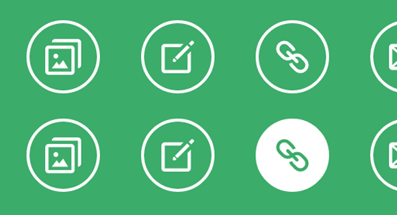
今天就为大家分享一组时尚而简单的鼠标经过图标动画效果。主要的原理是当经过图标或触发其伪元素时,利用css的transitions和animations属性,来实现的一些互动动画效果。在此之前,本站也介绍了很多css伪元素的文章,如:动画条纹边框、伪元素的多重选择、制作时尚焦点图相框等等。
构建HTML基本结构
在本示例当中用到的HTML结构极其简单,在一个大的div容器中放了几个描文本,通过css的样式控制就可以制作出多种效果出来,如下:
<div class="hi-icon-wrap hi-icon-effect-1 hi-icon-effect-1a">
    <a href="#" rel="external nofollow"  rel="external nofollow"  rel="external nofollow"  rel="external nofollow"  rel="external nofollow"  rel="external nofollow"  rel="external nofollow"  rel="external nofollow"  rel="external nofollow"  rel="external nofollow"  class="hi-icon hi-icon-mobile">Mobile</a>
    <a href="#" rel="external nofollow"  rel="external nofollow"  rel="external nofollow"  rel="external nofollow"  rel="external nofollow"  rel="external nofollow"  rel="external nofollow"  rel="external nofollow"  rel="external nofollow"  rel="external nofollow"  class="hi-icon hi-icon-screen">Desktop</a>
    <a href="#" rel="external nofollow"  rel="external nofollow"  rel="external nofollow"  rel="external nofollow"  rel="external nofollow"  rel="external nofollow"  rel="external nofollow"  rel="external nofollow"  rel="external nofollow"  rel="external nofollow"  class="hi-icon hi-icon-earth">Partners</a>
    <a href="#" rel="external nofollow"  rel="external nofollow"  rel="external nofollow"  rel="external nofollow"  rel="external nofollow"  rel="external nofollow"  rel="external nofollow"  rel="external nofollow"  rel="external nofollow"  rel="external nofollow"  class="hi-icon hi-icon-support">Support</a>
    <a href="#" rel="external nofollow"  rel="external nofollow"  rel="external nofollow"  rel="external nofollow"  rel="external nofollow"  rel="external nofollow"  rel="external nofollow"  rel="external nofollow"  rel="external nofollow"  rel="external nofollow"  class="hi-icon hi-icon-locked">Security</a>
</div>
简单的动画效果示例
这只是本文章中的其中一个示例(6),主要的效果是旋转动画。
.hi-icon-effect-6 .hi-icon {
    box-shadow: 0 0 0 4px rgba(255,255,255,1);
    transition: background 0.2s, color 0.2s;
}

.no-touch .hi-icon-effect-6 .hi-icon:hover {
    background: rgba(255,255,255,1);
    color: #64bb5d;
}

.no-touch .hi-icon-effect-6 .hi-icon:hover:before {
    animation: spinAround 2s linear infinite;
}

@keyframes spinAround {
    from {
        transform: rotate(0deg)
    }
    to {
        transform: rotate(360deg);
    }
}
上面的代码,只要你熟悉transitions和animations这两个标签,那就很容易理解。当鼠标经过.hi-icon-effect-6 .hi-icon时背景变成白色rgba(255,255,255,1),然后附带动画旋转transform: rotate()360度。其他的示例,大家可以下载附件,好好的看看其中的代码。
其实css3的动画效果就是这么简单,只需要给他相对应的属性值以及变换规则。接下来好好的欣赏这组简单的鼠标经过时动画效果吧。希望可以给你们带来启示。
译文:codrops

非常喜欢您的那个唯然的主题,能分享下主题文件就好了
楼主高手啊,学习了。
酷,喜欢O(∩_∩)O~~
果然和清新时尚
很不错的效果,以后使用一下看看
编程爱好者收藏了
这个博客很漂亮,赞!
喜欢分享的人,虽然我不用
呵呵!好好的创意啊!
请教个问题,为什么搜狗浏览器快速模式或火狐等浏览器运行这些效果的时候很正常,但到了IE就不行了呢?
需要浏览器支持css3
原来如此,但中国尚存许多网友习惯于IE,因此好多不错的元素都没法展现于每位访客,就看站长的取舍了。
真不错的效果,很清新。
又一个高手做的主题,膜拜了!
很不错,羡慕又技术的人,
高手啊,学习了 膜拜中
呵呵 谢谢博主分享
博主,长期互访互评哟~~
喜欢那个蓝色的效果,棒!
有几个还挺酷的
这个css技巧运用得非常好,学习价值很高。
哇!好,用来作为首页不错!!
朋友网站设计的好,页面设计与交互设计太棒了,向你学习。
共同学习。多多交流。
好酷的效果啊
您也可以使用第三方帐号登录
您也可以使用第三方帐号快捷注册